


The Atmosphere palette.

B1-E1-2 · Depth

B5-C1-1 · Identity

B4-C1-4 · Distance

B5-E2-2 · Structure

G5-C2-3 · Diffusion

GR-Y02 · Balance

GR-G04 · Light

P5-C2-1 · Optional accent

B1-A1-3 · Optional accent
Proportions vary with the building, the light and the materials. Digital swatches match the source presentation. Match physical Plascon samples, finish and coating requirements before specification.
Colour shapes the space between structure and experience.
How a space is seen changes how it is felt.
Human experience
Depth, orientation and calm.
Responsive buildings
Colour in changing light.
Chromatic neutrals
Blue-grey, mineral and diffused light.
Everyday spaces
Identity without visual overload.


Glass and woven texture
Cool greys and blue-greens sit beside clear glass and pale mineral surfaces.

Ribbed glass carries the light. Rough stone, timber grain and woven textiles add tactile contrast.
Material concept. Swatches reference the palette, not exact image samples.
Metal, stone and light
Reflective metal adds precision. Pale mineral surfaces soften the cool range.

Stone, weathered timber and cloth retain their texture beside smooth colour planes and reflective metal.
Material concept. Swatches reference the palette, not exact image samples.


Blue at scale.
Moving beyond a decorative accent, blue defines a substantial volume and gives the space identity.

Architectural concept: curved architectural volume. Match physical Plascon samples before specification.
Cool colour. Warmer material relationships.
Meteor defines steel portals and a canopy soffit.

Painted: steel portals and canopy soffit. Companions: rough stone wall and pale paving.
Architectural concept. Paint assignments refer only to the labelled surfaces; companion materials retain their natural finish.


Cool colour. Warmer material relationships.
Wintergreen Mist softens a circulation wall and waiting alcove.

Painted: circulation wall and waiting alcove. Companions: timber seating and stone floor.
Architectural concept. Paint assignments refer only to the labelled surfaces; companion materials retain their natural finish.
Colour, reflection and light.
Cool panelled volumes. Mineral neutrals. Glass, reflective metal and mineral surfaces.
TRANSPORT INFRASTRUCTURE CONCEPT. Let light vary the material. Architectural concept: palette-level study. Exact paint assignments are not specified in this original image.

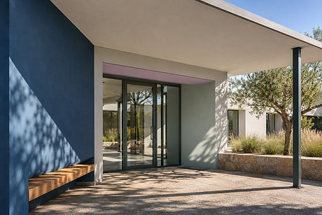
Warm Violet. Signal the threshold.
P5-C2-1 · A small entrance-head reveal. Small area. Clear purpose.

Typically 1–5%. One accent may be enough. A threshold, a reveal, a route or a screen. Architectural concept: intended application, not exact paint appearance. Match physical Plascon samples before specification.
Granada Bay. Filter the view.
B1-A1-3 · A slim vertical slatted screen. Small area. Clear purpose.

Typically 1–5%. One accent may be enough. A threshold, a reveal, a route or a screen. Architectural concept: intended application, not exact paint appearance. Match physical Plascon samples before specification.

The Atmosphere palette.
B1-E1-2 · Depth
B5-C1-1 · Identity
B4-C1-4 · Distance
B5-E2-2 · Structure
G5-C2-3 · Diffusion
GR-Y02 · Balance
GR-G04 · Light
P5-C2-1 · Optional accent
B1-A1-3 · Optional accent
Proportions vary with the building, the light and the materials. Digital swatches match the source presentation. Match physical Plascon samples, finish and coating requirements before specification.
Architectural and material concepts illustrate intended surfaces, not built-project photography or certified paint matches. Match physical Plascon samples, finish and coating requirements before specification. Accent guidance: typically 1–5%; one accent may be enough.
Created by Trend Forward Creative Agency.